
1-20 of 1277
Follow your search
Access your saved searches in your account
Would you like to receive an alert when new items match your search?
Journal Articles
Journal:
Journal of Human Immunity
J Hum Immun (2026) 2 (5): e20250256.
Published: 23 June 2026
Includes: Supplementary data
in Thalidomide for CGD-related inflammatory bowel disease: A randomized, double-blind trial
> Journal of Human Immunity
Published: 23 June 2026
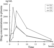
Figure 1. Plasma drug concentrations in the thalidomide group. Plasma drug concentrations following the initial administration of thalidomide were measured in two pediatric patients (T1 and T3) and one adult patient (T2) in the thalidomide More about this image found in Plasma drug concentrations in the thalidomide group. Plasma drug concentra...
in Thalidomide for CGD-related inflammatory bowel disease: A randomized, double-blind trial
> Journal of Human Immunity
Published: 23 June 2026
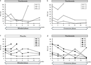
Figure 2. PUCAI scores of patients in the blinded phase and the extension phase. (a and b) In the thalidomide group, the patients were treated with thalidomide in the blinded phase (a) and the extension phase (b). The final markers of each line More about this image found in PUCAI scores of patients in the blinded phase and the extension phase. (a a...
in Thalidomide for CGD-related inflammatory bowel disease: A randomized, double-blind trial
> Journal of Human Immunity
Published: 23 June 2026
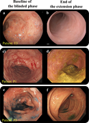
Figure 3. Improvement in colonoscopy findings after thalidomide administration. (a and b) In T3, who achieved remission at the end of the extension phase, lymphoid hyperplasia with red halos was prominent in the distal sigmoid colon before the More about this image found in Improvement in colonoscopy findings after thalidomide administration. (a an...
in Thalidomide for CGD-related inflammatory bowel disease: A randomized, double-blind trial
> Journal of Human Immunity
Published: 23 June 2026
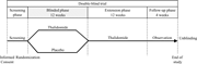
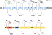
Figure 4. Study design. The patients were randomly assigned to a 12-wk treatment of thalidomide or placebo (blinded phase) followed by a 12-wk extension phase (thalidomide administration). The patients were visited at 4 wk after the treatment More about this image found in Study design. The patients were randomly assigned to a 12-wk treatment of ...
Journal Articles
Journal:
Journal of Human Immunity
J Hum Immun (2026) 2 (5): e20250108.
Published: 16 June 2026
Includes: Supplementary data
Journal Articles
in ADA2 genotype and enzyme activity may predict vasculitic or hematologic DADA2 phenotype
> Journal of Human Immunity
Published: 16 June 2026
Figure 1. ADA2 variants are distributed throughout the entire gene. ADA2 gene (above) and protein (below). Exons 1–10 are depicted as bars, and introns as lines (not to scale). Variants in this cohort are colored in green, red, or blue, More about this image found in ADA2 variants are distributed throughout the entire gene. ADA2 gene (above...
in ADA2 genotype and enzyme activity may predict vasculitic or hematologic DADA2 phenotype
> Journal of Human Immunity
Published: 16 June 2026
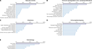
Figure 2. DADA2 clinical phenotypes and laboratory immune phenotypes are heterogeneous. (A–E) Clinical phenotypes given as fraction of a total of n = 48 patients. The upper bar shows the fraction of patients showing any of the clinical More about this image found in DADA2 clinical phenotypes and laboratory immune phenotypes are heterogeneou...
in ADA2 genotype and enzyme activity may predict vasculitic or hematologic DADA2 phenotype
> Journal of Human Immunity
Published: 16 June 2026
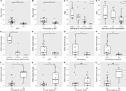
Figure 3. DADA2 phenotypes follow distinct demographic, clinical, therapeutic, genetic, and biochemical correlations. Relation of clinical phenotype, age at disease onset, age, ex vivo ADA2 enzymatic activity, and allele activity in vitro. More about this image found in DADA2 phenotypes follow distinct demographic, clinical, therapeutic, geneti...
in ADA2 genotype and enzyme activity may predict vasculitic or hematologic DADA2 phenotype
> Journal of Human Immunity
Published: 16 June 2026
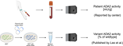
Figure 4. Residual ADA2 activity of patients and variants are distinct properties. Above: Patient ADA2 activity is measured in blood samples ex vivo. Values were reported by the respective centers, commonly in mU/g. Below: The ADA2 activity of a More about this image found in Residual ADA2 activity of patients and variants are distinct properties. A...
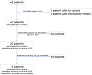
in ADA2 genotype and enzyme activity may predict vasculitic or hematologic DADA2 phenotype
> Journal of Human Immunity
Published: 16 June 2026
Figure 5. Classification algorithm for the correlation of patient and variant ADA2 activity. Allele classification according to Lee et al. ( 13 ) and correlation to patients’ (ex vivo) ADA2 enzymatic activity. The 16 final patients could be More about this image found in Classification algorithm for the correlation of patient and variant ADA2 ac...
Journal Articles
Journal Articles
Journal:
Journal of Human Immunity
J Hum Immun (2026) 2 (5): e20250227.
Published: 09 June 2026
Includes: Supplementary data
in A homozygous CTLA-4 variant causes CTLA-4 deficiency with severe immune dysregulation
> Journal of Human Immunity
Published: 09 June 2026
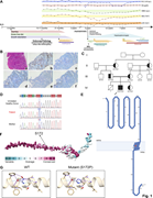
Figure 1. Identification and structural characterization of the homozygous CTLA4 S172P/S172P variant associated with immune dysregulation. (A) Clinical timeline illustrating patient presentation, treatment interventions, and key laboratory More about this image found in Identification and structural characterization of the homozygous CT...
in A homozygous CTLA-4 variant causes CTLA-4 deficiency with severe immune dysregulation
> Journal of Human Immunity
Published: 09 June 2026
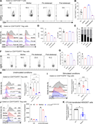
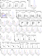
Figure 2. CTLA4 S172P/S172P variant disrupts CTLA-4 expression in CD4 + FOXP3 + Tregs. (A) Representative flow cytometry plot showing the frequency of CD4+FOXP3+ Tregs. (B) Bar graph depicting the percentages of CD4+FOXP3+ Tregs. (C) More about this image found in CTLA4 S172P/S172P variant di...
in A homozygous CTLA-4 variant causes CTLA-4 deficiency with severe immune dysregulation
> Journal of Human Immunity
Published: 09 June 2026
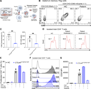
Figure 3. CTLA4 S172P/S172P variant severely impairs CD80 transendocytosis and drives CD4 + T cell hyperproliferation. (A) Schematic representation depicting the principle of the in vitro CD80 transendocytosis assay. (B) Representative More about this image found in CTLA4 S172P/S172P variant se...
in A homozygous CTLA-4 variant causes CTLA-4 deficiency with severe immune dysregulation
> Journal of Human Immunity
Published: 09 June 2026
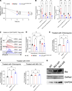
Figure 4. CTLA4 S172P/S172P variant accelerates the lysosomal degradation of CTLA-4. (A) PBMCs were treated with 30 μg/ml CHX for up to 4 h at 37°C and stained for total CTLA-4. The graph shows total CTLA-4 expression relative to 0 h, More about this image found in CTLA4 S172P/S172P variant ac...
in A homozygous CTLA-4 variant causes CTLA-4 deficiency with severe immune dysregulation
> Journal of Human Immunity
Published: 09 June 2026
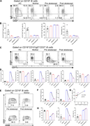
Figure 5. Abatacept restores T cell homeostasis disrupted by the CTLA4 S172P/S172P variant. (A) Representative flow cytometry plots of CXCR5+PD-1+ cTFH cells comparing HCs, mother, and patient before and after abatacept treatment (12 mo). (B) More about this image found in Abatacept restores T cell homeostasis disrupted by the CTLA4...
in A homozygous CTLA-4 variant causes CTLA-4 deficiency with severe immune dysregulation
> Journal of Human Immunity
Published: 09 June 2026
Figure 6. Abatacept partially normalizes B cell phenotype and reduces activated cell subsets in the CTLA4 S172P/S172P patient. (A) Representative plots illustrate naïve B cells (IgD+CD27−), class-switched memory B cells (IgD−CD27+), and More about this image found in Abatacept partially normalizes B cell phenotype and reduces activated cell ...

